Methodology: Because “Extreme Temperatures” is such a broad topic, I was able to be more specific when looking for the type of source I wanted. I therefore googled “Extreme Temperatures US Index” and specified Climate.gov as my site because that I am familiar with Climate.gov and know that it is a reputable source. I immediately found options for how to present the data, including graphs and maps. I specified maps and came across the source below.
- U.S. Climate Extremes Index (CEI)
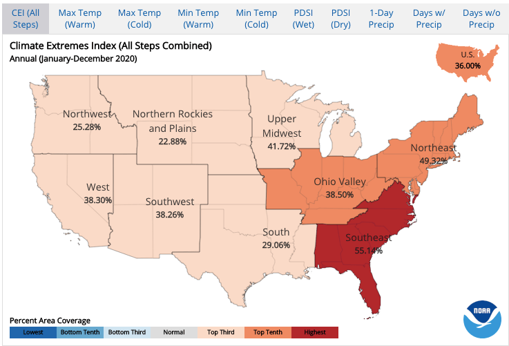
This interactive map allows you to choose a period/season from the options below to display a regional analysis of the most recent year. Once you choose your region of interest, an interactive graphical analysis tool appears that allows you to:
Choose a period/season and an indicator from the options below and click “Plot” to create a time series graph. Note that the sixth indicator (Step 6) is not calculated for the spring (March-May), winter (December-February) and cold (October-March) seasons since most months during these periods are outside of the traditional hurricane season.
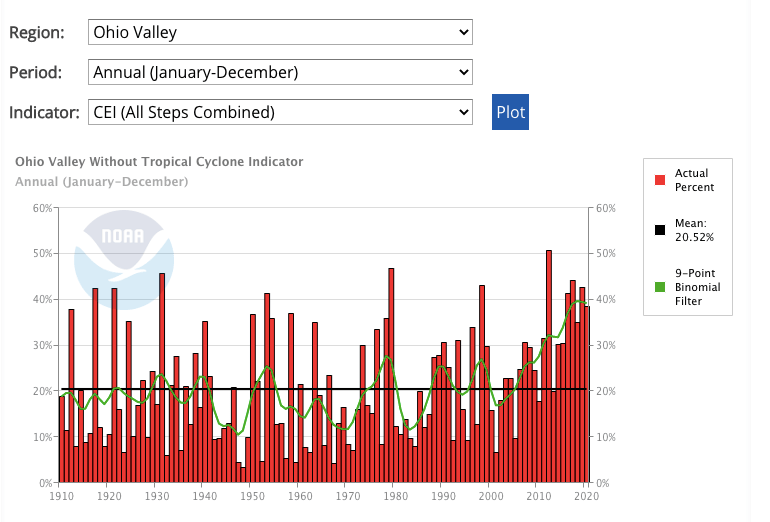
One example of the graphical analysis from Ohio Valley is shown below: