The two most relevant results of a Google search about the geographical distribution of educational attainment – educational levels of the population- in the United States, are:
Educational Attainment Visualizations – Census Bureau
A typical Census Bureau visualization is a visual presentation of data made with charts, tables, maps, and other graphic elements. Visualizations are often interactive and contain text for labeling, but do not have the narrative text of infographics. Like infographics, they are effective because they simplify information and make use of the human ability to see patterns and trends.
Most of our visualizations can be shared, embedded, downloaded, and printed. We provide source and methodology information.

Black Education on the Rise

Most Educated Counties in the US
Luz K. Molina, a Marine Scientist interested in interactive data visualization, with a Masters on Phytoplankton Abundance and Composition at USM, and a PhD in Visualization from Manchester Metropolitan University, has put together a set of interactive Educational Attainment map of the US. The data is from 2017. The size of the bubbles represent the population of a county. The color is the percentage of population that obtained the degree selected.
The 10 Most Educated Counties with at Least a Graduate Degrees:
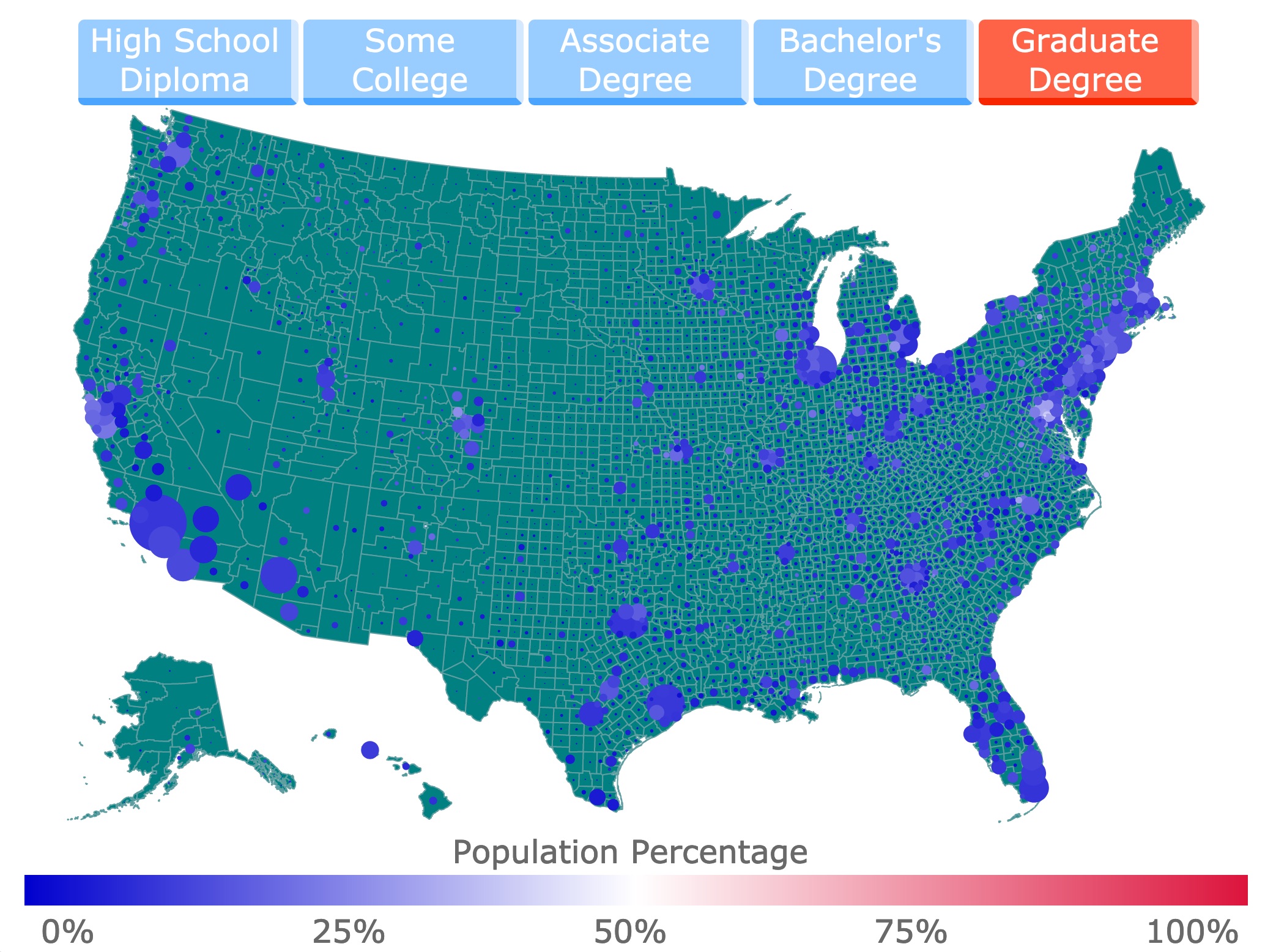
- Falls Church City, Virginia: 42.54%
- Los Alamos County, New Mexico: 40.29%
- Arlington County, Virginia: 39.43%
- District of Columbia: 32.77%
- Alexandria City, Virginia: 32.6%
- Orange County, North Carolina: 31.75%
- Montgomery County, Maryland: 31.6%
- Howard County, Maryland: 31.12%
- Tompkins County, New York: 29.77%
- Fairfax, Virginia: 29.69%
